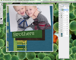
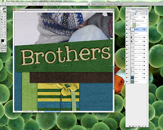
Today I'm going to show you how to make a paper title which will be most useful if you'd like to do the Challenge of the Week where we need to make a layout with a paper title to earn the points. A paper title is pretty simple, basically it's where you clip a paper to a font, alpha, or word art to make it much more cool. Clipping a paper to an alpha or word art is pretty simple, just position your paper above the title layer, use Ctrl + G to clip the paper to the layer & Ctrl +E to merge them together.
But what if you want to clip a paper to a font? It's also simple to do but there are a few tricks you should know about. First, if you're going to clip a paper to a font, it's usually best to use a cardstock or paper with a light pattern. You can use a paper with a busy pattern if it's just the title but if you're going to use the paper on journaling, you really want something that not to busy. That's why if a kit has a cardstock add-on it's good to grab it so you've got some nice solid papers to use with your journaling.
To get started pick your font & type up your title/journaling. I always find it best to do the title/journaling last & get everything positioned/sized before I clip a paper.
Now you can either leave your text layer as is or rasterize the layer. Personally, I always leave the text unrasterized 'cause I'm a horrible speller; it also makes it easier to make changes to the text later. Pick the paper you want to use, position it above the text layer & then clip it using Ctrl +G. If you've left the text layer unrasterized, you won't be able to merge them together but that's OK.

If that's all you want to do, add drop shadows to your text layer & you're done! But what if you want to add a little border to your text? It takes a few more steps but once you get the hang of it, it won't take long.
First, double click on the text layer to bring up the Layer Style box. I always like to make sure there are no drop shadows when doing this. Now select the Stroke option. You'll see that there is now a thin red outline around your text. You can change the size of the stroke as well as it's position; for the purposes of this example, I'm going to change the position to the Inside option. Don't worry about changing the color as that doesn't matter since we'll be clipping a paper to the stroke.
Next, let's get that stroke on its own layer as you can't clip a paper to it when it's just a layer option. Right click on the layer, making sure that your pointer is over the far right side of the box. If you right click but don't get the full menu, just move your pointer over a little bit, it's just a Photoshop quirk.
In the pop-up menu, click on the Create Layer option. This will take all the different layer styles & put each one on into it's own layer. That's why I wait on drop shadows as if you had them on the text layer, it would turn the drop shadows into their own layer. But you'll notice a small problem, if you've got a paper clipped to text layer your stroke layer might seem to disappear. Don't worry, it's still there just hidden under the paper layer.
Quick side note: If you choose the Inside option back in the Layer Style box, the new layer will be above & clipped to the text layer. Choosing the Outside option will create the stroke on a layer below the text layer. Choosing the Center option will create the stroke on a layer above the text layer but not clipped to it. As there are so many different options, you'll need to have some fun playing around to find the one you like!
Back to the Inside option. Now you might be tempted to just drag the stroke above the paper layer so it's still clipped to everything & then clip the new paper to your stroke. Nope, won't work as you'll get the same problem where the paper covers up everything under it.
Instead, drag the stroke under the text layer where it's not clipped to anything. You'll notice that there's a huge red box now but that's OK as it's just what the stroke looks like when it's not clipped to anything. Position your paper above the stroke layer, use Ctrl + G to clip it to the stroke layer & Ctrl + E to merge them together; they need to be merged for this to work!
Drag your merged stroke layer up above both the text layer & the paper layer. Use Ctrl + G to clip your stroke back to the text & volia! A lovely paper stroke around your paper text!
If you want to add a drop shadow to your text, make sure to add it to your text layer & not the stroke layer or else it'll look really funky.

Keep in mind that if you want to edit your text, you need to do it before making the stroke. If you do the stroke & then find that something spelled wrong or missing a word [why yes I have done this!] you'll need to delete the stroke layer & start all over again. So make sure things are A-OK before doing the stroke! Now go have some fun & submit a layout using a paper title for the Challenge of the Week by Saturday night!
Disclaimer for Tutorials: I use Photoshop CS 8 for Mac so I can't speak to how things may work in a different program. However, I've posted this tutorial in the forum & if you have any other general tips or tips for different programs, please post them in the thread for everyone to see!


1 comment:
Thanks for this! I've been wondering how to do that.
Post a Comment