OK, to fill in your font first get your title or journaling how you like it [don't forget to spell check!] & make sure that the font is closed.
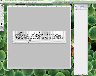
Now use the Magic Wand Tool to select all the areas inside of your text with the marching ants. Make sure that the Contiguous Box is checked before you start or the wand will select all the empty areas & we don't want that! If you have more than one word, hold down the Shift key while you select different areas so they are all added to the same selection. And don't forget about the dots over the i's!
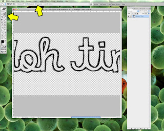
I'm now going to show you two different ways to fill in the text, clean & messy; let's start with the clean version. With the ants still marching, we need to expand the selection to make sure the fill is nice & clean so go to Select --> Modify --> Expand. Expand your selection by at least 3 pixels but not more than 5 or so as you don't want to go past the outline of the font.
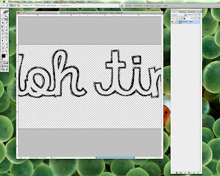
Next you'll need to make a new fill layer so go to Layer --> New --> Fill Layer --> Solid Color. When the color section box pops up, pick a color other than black & click on OK. Move your new fill layer below your text if needed.
You can now clip a paper to this new layer, your text is now filled & is nice & neat!
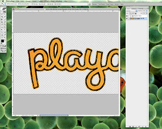
But what if you want your font to look a little messy? After selecting the area inside of the text & with the ants still marching, go to Select --> Modify --> Expand. Expand your selection by as much as you would like to get the selection beyond the outline of the font. You may need to try out a couple of different sizes until you find what you like, I've gone with an expansion of 20 pixels. Follow the same steps as above to make a new fill layer. As you can see, the fill layer extends just a little bit past the outline.
Clip your paper to the fill layer & you've got a bit of a messy look to your font! I think this is how I'm going to keep it as my life is always messy with two little boys.
Go ahead & try this with the November Font Challenge, there are a few tricks to using this month's font so read the top post carefully. I'll be back next week with the second part of this tutorial, right now it's time to start the Thanksgiving cooking madness!


No comments:
Post a Comment