We've covered how to use templates & make your layout pop with drop shadows but what do you do if you need a layout done quickly? Luckily, many designers also sell quick page or brag book sets that coordinate with their kits & these are your best bet for making a quick album as a gift. Quick pages are very easy to use but there are a few tricks; for my examples I'm using two quick pages from the new kit, Apple Delight by the Designing Divas. Click on any of the photos for a closer look at each step.
First, open up the quick page in your scrapping program. You'll notice that there is only one layer that has slots for your pictures.
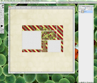
Open up the pictures you want to use, place them underneath the quick page, then re-size & rotate the pictures until you've got them positioned how you'd like them. If you happen to have one picture overlapping another, you can either move that picture to the bottom layer or use your eraser tool to erase the parts that are showing.
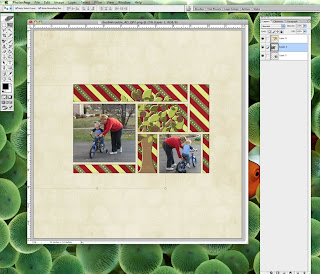
Once you've got your pictures positioned, you can add elements, a title, date, or journaling to the quick page. Naturally, all these additions should go on top of the quick page & you should use drop shadows on the additions. Just play around with the shadows until you've got something that looks good with the page. You can also do a light shadow on the quick page layer if you like, it all depends on what looks good to you.
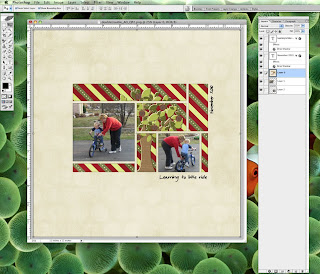
After everything has been added make sure to save & then you can merge all the layers together. I like to keep a copy of the un-merged product just in case I need to change something for a future printing [of course it helps I have a 1 TB hard drive!]. Once you've merged all the layers, you can save the layout as a JPEG; be sure to save it at the best resolution you can for great print quality. All done!
But what to do if you have a quick page that has overlapping photos? Bet you think there is nothing to do ... well, I've found an easy trick to using those quick pages! Start out the same as above, open your quick page then open & position your photos. You'll see in the example that I don't have any problem with the top photo but there's an issue with the bottom two photos.
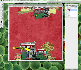
Now what you need to do is make a copy of the photo that is overlapping. In the example I'm going to make a copy of Layer 2 which is overlapping Layer 3. You can tell this is the right photo to copy as it is also the one with the shadow on it. If you have multiple photos that are overlapping, you'll want to do this step one photo at a time, I would probably start from the bottom up for the best results.
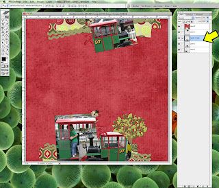
Now, turn off your picture layers so all that is visible is the quick page layer. Using your magic wand tool & making sure that the contiguous option selected, click within the picture area that needs to be trimmed. Marching ants will show up & if you look closely, you'll see that magic wand has selected everything but the shadows; that's OK as we want that result. The ants go marching two by two hurrah, hurrah ... OK, gonna have that song in my head all day. Back on track!
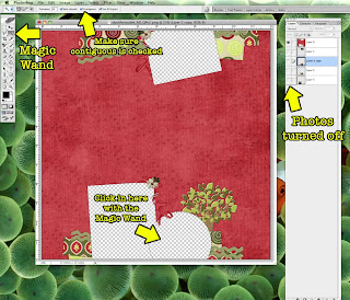
With the ants still marching, insert a new, blank layer underneath your photo copy. With the new layer selected, use your paint bucket tool & click inside of the marching ants to fill it up. Now you can turn off the ants using Ctrl + D & clip your photo (Layer 2 copy) using Ctrl + G to the new layer (Layer 4) you just made. Now you're ready to do some erasing.
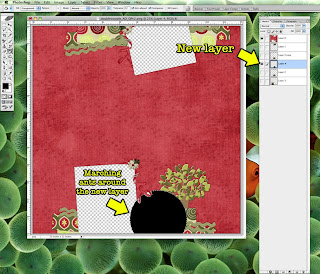
I would recommend zooming in for the next step just to make sure you're not going to erase anything important. When you zoom in, you'll see that there is some transparent white space around your photo & that's OK, it'll disappear in the next step.
Turn on your original picture layer (Layer 2) & use the eraser or select tool to get rid of the overlapping parts. You'll notice that by doing this, those white spaces are now filled in. Be very careful to make sure you don't erase anything over the transparent white spaces. Now turn back on your other picture layers & you can finish off your quick page by following the remaining steps listed above.
Wasn't that easy? Now this technique will only work if your photo slots have shadows or frames around them. If the photo slots have a frame around them, all you need to do is carefully erase the parts peeking out from under the frame. Again, zoom in so you can see what you're doing up close. I'll be honest that I'm not sure what to do if the quick page or brag book has overlapping photos without shadows or frames, the only option I can think of would be to use one large picture that covers all the photo slots.
Therefore if you're making quick pages to give away as freebies or sell as part of a kit, make sure to include the drop shadows on the photo slots, it's easy to do. First, use the free action for PSE & PS available in this thread to create your photo slots. You'll notice that not only does the action cut out the slots, it also deletes any drop shadows or strokes on the picture slot. All you'll need to do is reapply your drop shadow or stroke before saving the layout as a PNG. In addition you can find some great tips on making quick pages in this thread. Enjoy!
Disclaimer for Tutorials: I use Photoshop CS 8 for Mac so I can't speak to how things may work in a different program. However, I've posted this tutorial in the forum & if you have any other general tips or tips for different programs, please post them in the thread for everyone to see!



No comments:
Post a Comment