1. Open up a back ground paper that coordinates with your page. (haha - simple!)
2. Select a font that you would like your title to be in then click on the background paper to create a new text layer. Type your title. I would suggest that larger is better than smaller - you can always re-size down after.
3. ***optional*** At this point, if you would like your font to be more bold, you can go to "Layer/Layer Style/Stroke" then add a stroke to your font until you like the size. (color doesn't matter!!) Then create a new, blank layer and merge that layer with your text layer
4. Right click on the thumbnail of the layer with your text and select "Select Layer Transparency" - this will put the marching ants around your words.
5. Select the background layer and copy (either Ctrl C or Edit/Copy) then go to your Layout and paste. Adjust the size to your liking.
*******************PSE Changes *************************
Thanks To Manda K of Nibbles Skribbles for these changes required for PSE!
3. ***optional*** At this point, if you would like your font to be more bold, you must first simplify your text. Right click on the layer and select "simplify layer." Now you can go to "Edit/Stroke" and add a stroke to your font until you like the size. (color doesn't matter!!)
4. Next we need to select our text. Using the magic wand tool, select all of the blank space around your text (be sure to get the little spots inside the "A's and P's etc.). Then go to Select/Select Inverse to select your text.
4. Next we need to select our text. Using the magic wand tool, select all of the blank space around your text (be sure to get the little spots inside the "A's and P's etc.). Then go to Select/Select Inverse to select your text.
An alternative to selecting the text with the magic wand, in cases of fancy or distressed fonts is to place the background paper above the text level and press CTRL-G (CMD-G) to clip the paper to your words. Then right click on the paper layer and "Merge Down" to combine them. This eliminates the need for Step 5.
5. Select the background layer and copy (either Ctrl C or Edit/Copy) then go to your Layout and paste. Adjust the size to your liking.
***********************************************************************5. Select the background layer and copy (either Ctrl C or Edit/Copy) then go to your Layout and paste. Adjust the size to your liking.
This is the basic technique. After this there are a few things you can do to give it a different look. You can add a stroke around the edges (similar to the optional step 3) in a coordinating color. You can add other words using different fonts. You can use brushes or other elements from the kit behind it. You can play with the bevel (Layer/Layer Style/Bevel and Emboss) to give it some depth.
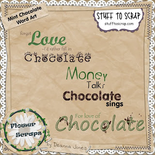
Now the freebie! Using this technique, I've taken my newest kit "Mint Chocolate" and made you some word art! Check out the kit in my store and enjoy!!
 Download HERE

9 comments:
I'm a total newbie and couldn't follow this tutorial!!! When I create a new layer it is a transparent layer and doesn't give me the option to merge down, so I unclicked the eyeball on my background paper and merged visible, but then when I right click on the thumbnail, it doesn't give me the select layer transparency option. I have CS4. Maybe I need a class. {sigh}
I was really excited to try this, too, and then I realized I have Elements and not C2 (anymore). I got stuck on step 4. booo. It would be really cool if I could do this!
Rose if you select both layers by holding the shift key you can then go to "Layers/ Merge Layers" or select both layers and click ctrl E
Please feel free to email me at Flowerscrap@gmail.com with questions!!
Thank you! Your blog post will be advertised on the DigiFree Digital Scrapbooking Freebie search engine today (look for timestamp: 24 Jun [LA 07:00pm, NY 09:00pm] - 25 Jun [UK 02:00am, OZ 12:00pm] ).
This WA is too perfect. Thanks!
Love it....thanks a million!
I tried following the tutorial but couldn't do it either :( I have photoshop CS2 and if I want to merga layers I have to first rasterize the text layer. And I guess that's ok. My problem is the stroke I use to make the font bolder. It doesn't get the colour of the paper I am using, it stays the same colour that you first chose and it looks really awful :(
Simona - makes sure that you are putting the stroke on the font layer and that the layer with the paper doesn't have a stroke (or if it does, click on the layer style to change to color to a matching one)
Post a Comment